Your homepage will often be the first interaction your brand will have with your prospective customers. We all know that first impressions count so it’s incredibly important that you make a great one. Making a great first impression can lead to customer trust and as a result you’re more likely to convert that trust into sales. The impression that you make on your customers the first time can end up lasting for years. Investing in a well-designed homepage (and website for that matter) is therefore integral to your success.
Ascertain the problems with your homepage
One of the first things to do when designing or redesigning your homepage is to consider what your customers wouldn’t like to see and what would make them bounce off your website. If you can stay away from these factors, you’re going to be more successful in the long run.
Less is more
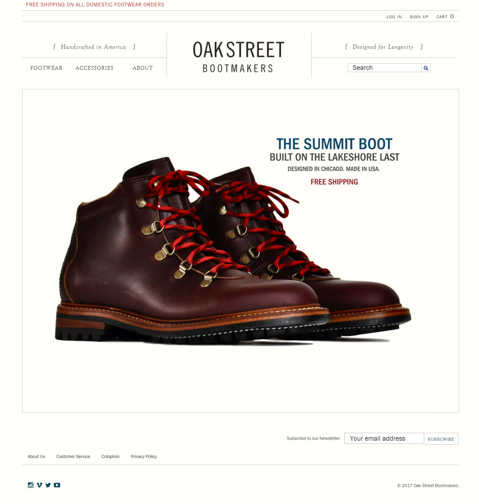
Many online retailers bombard their customers with too much information on their homepage; telling them everything about their company and their products. Your end users will react in a more positive manner if you give them less to process. A perfect example of this is
Oakstreet Bootmakers. Their homepage gets straight to the point with a simple banner combined with a clean and minimalist design.
Have a clear proposition of value
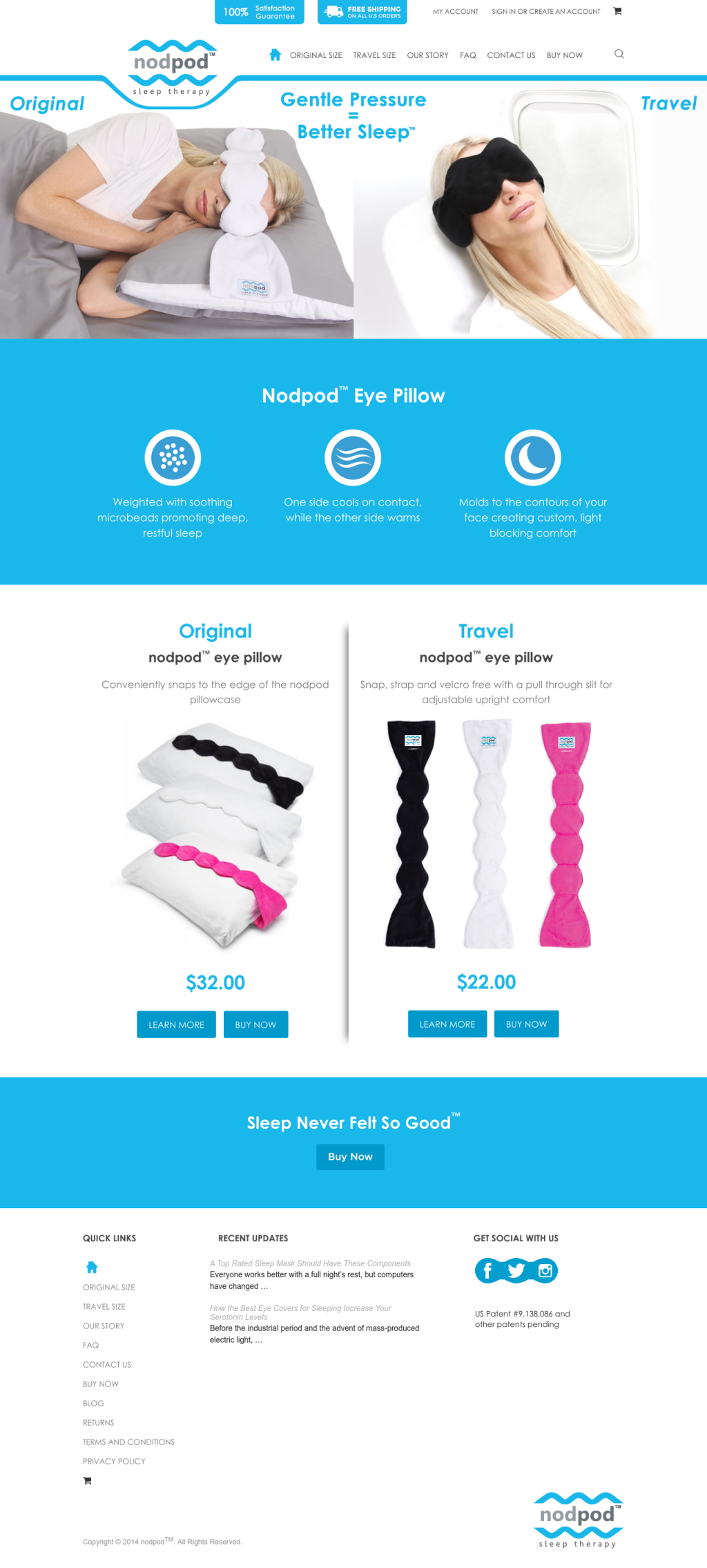
Your users need to understand why you’re different to your competitors there and then. Instant impact is paramount. Why should your customers buy your products instead of your competitors? Quality of products? Free or faster shipping? Let your users know.
Nodpod achieve this by adding a satisfaction guarantee and free shipping while providing a simple explanation of the product’s features.
Navigation is key
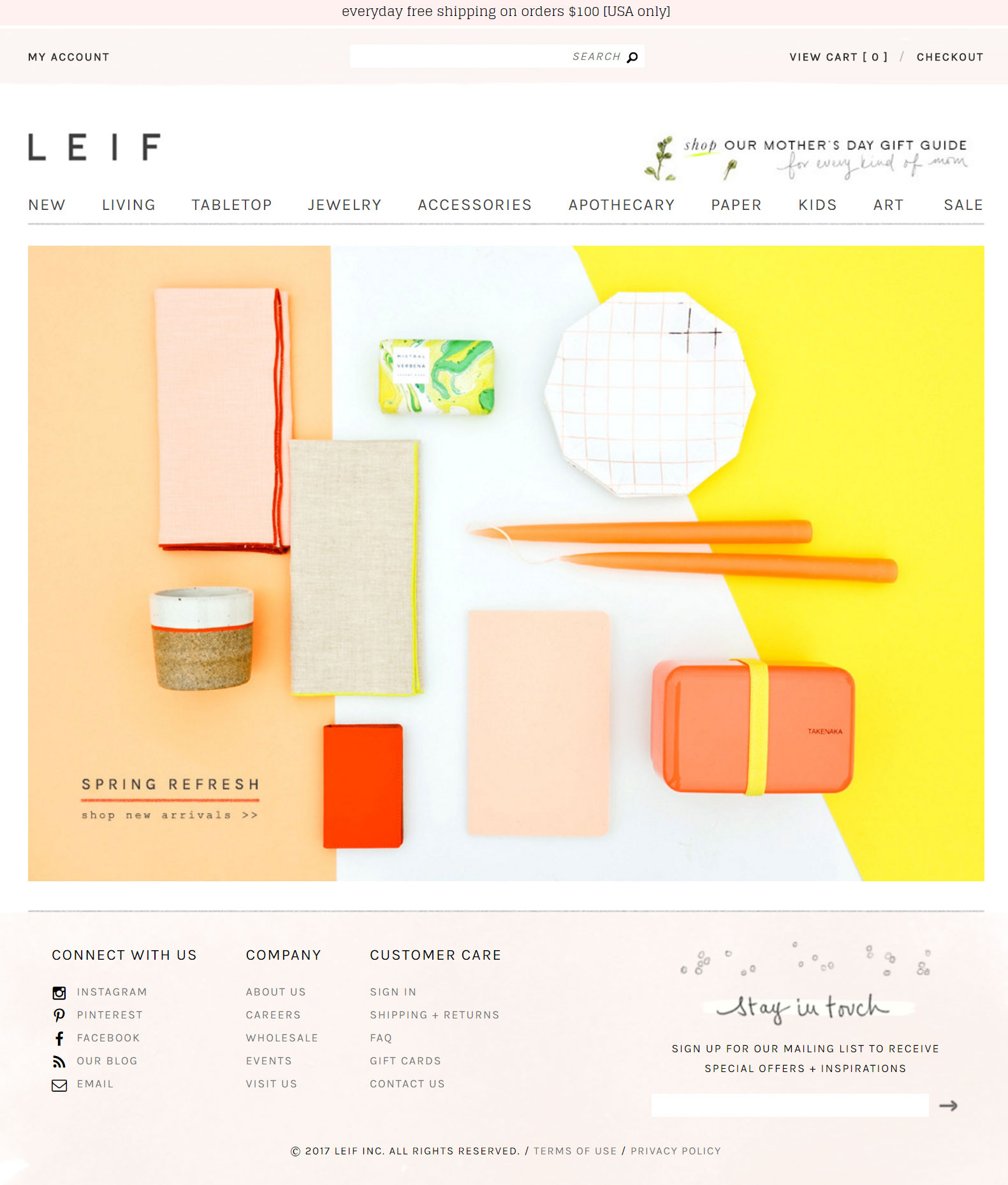
If your navigation is hard to find then your customers will get frustrated and leave your site. Make sure your navigation is easily accessible and that your search bar is prominent.
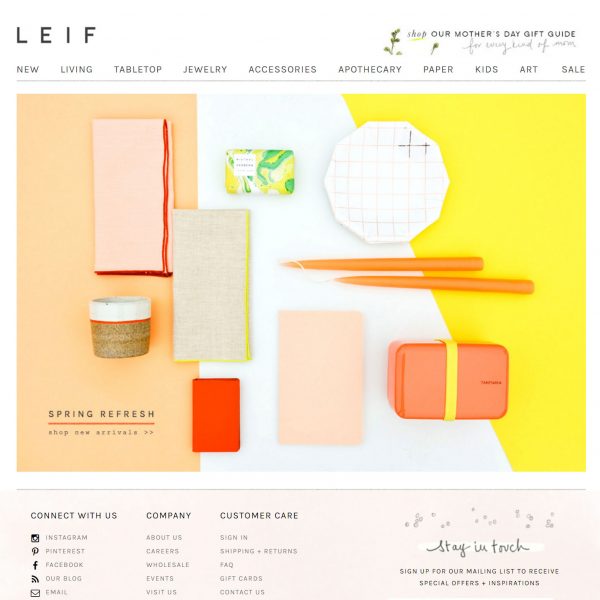
Leif keep their homepage very clean and their navigation simple allowing their users to easily move about their site.
Build trust with your About page
As we’ve mentioned before, it’s really important to build trust with your customers and to let them know who you are.
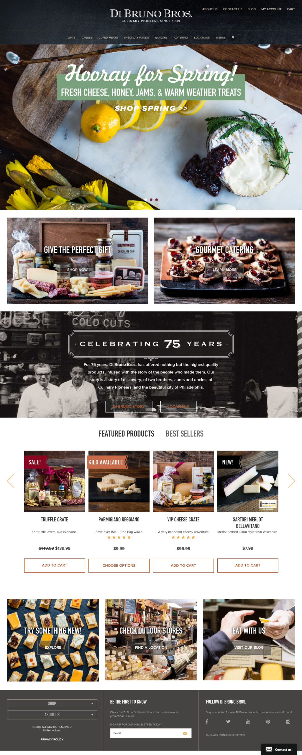
Di Bruno Bros starts telling their story on their homepage without going over the top. Users can continue to learn about them through their About page that is easily found at the top right-hand corner of their homepage.
While there are countless ways to optimise your homepage, you can start applying these techniques to get the process going. It’s all about first impressions!
